Photo filters examples: color correction online
Photo filters examples you can build yourself: warm film, faded matte, cool night, high-contrast black and white. This page opens the full editor, where each look is made from real adjustments — curves, levels, color balance, photo filter and adjustment layers.
- Live preview
- Adjustment layers
- 27 blend modes
- Nothing to install
- Opens
- JPG
- PNG
- WebP
- GIF
- BMP
- TIFF
How to apply photo filters online
Open a photo
The frame above opens the full editor. Choose “Open…” and pick a file: PNG, JPEG, WebP, GIF (first frame), BMP, SVG, ICO, AVIF, uncompressed TIFF or a .photo project.
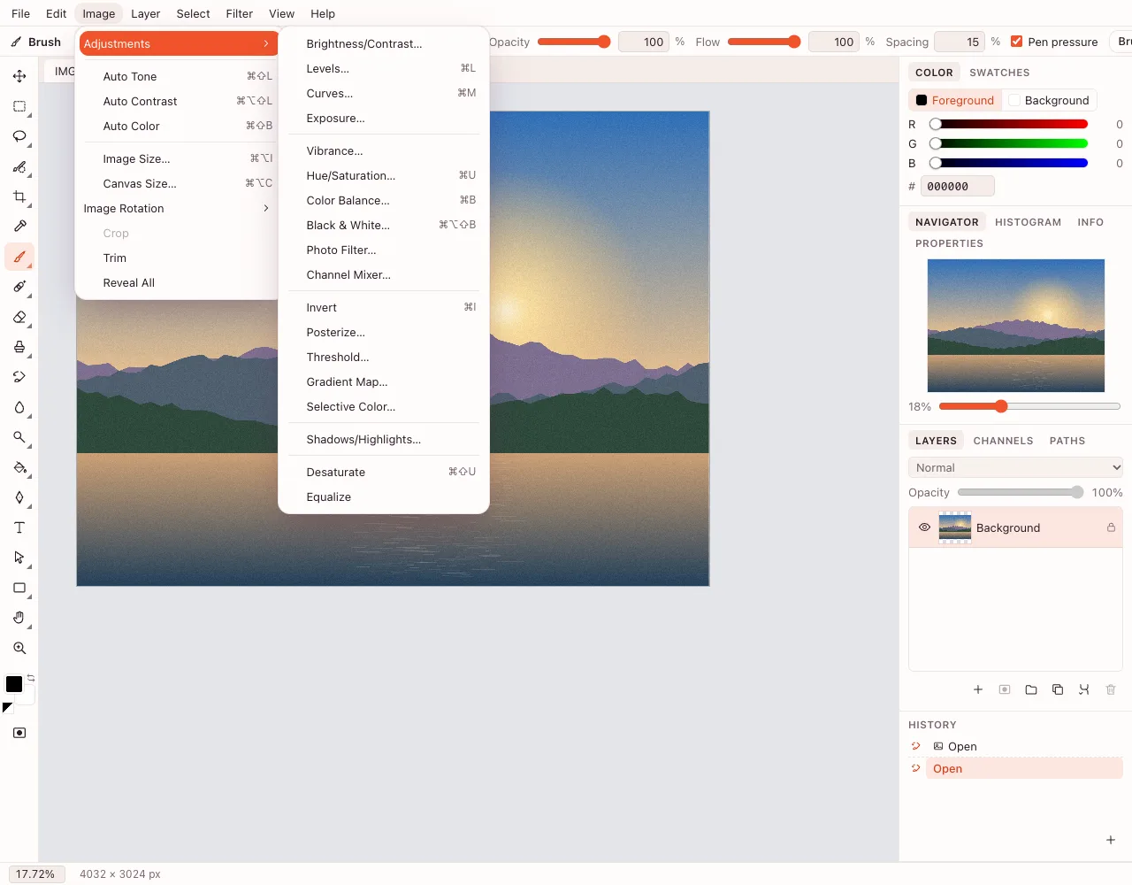
Choose an adjustment
Open “Image” → “Adjustments”. The menu lists Brightness/Contrast, Levels, Curves, Exposure, Hue/Saturation, Color Balance, Photo Filter and more. Each one opens with a live preview.
Shape the color
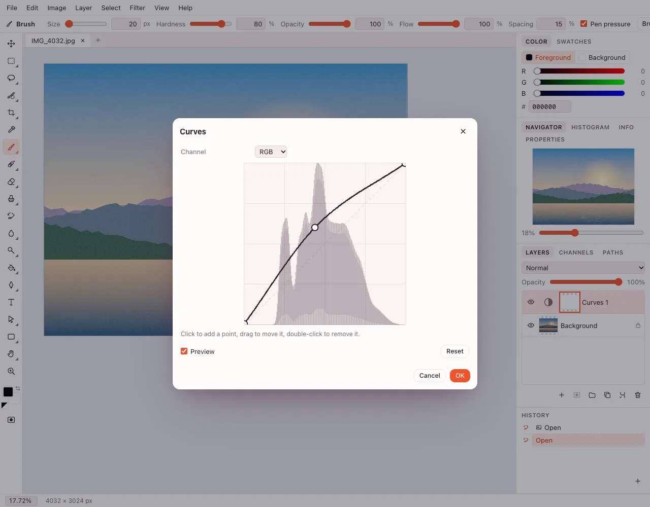
In “Curves…”, drag points on the curve or switch to a color channel to remove a cast. In “Color Balance…”, move shadows, midtones and highlights toward warm or cool. Small moves usually beat large ones.
Keep it editable
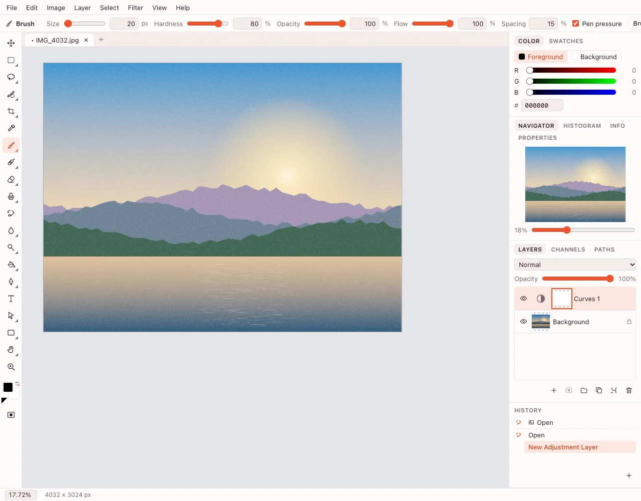
For a non-destructive edit, use “Layer” → “New Adjustment Layer”. Reopen it by double-clicking, mask it to one area, and export with “File” → “Export As…” in PNG, JPEG or WebP.
What color correction does
Color correction fixes the color and tone of a photo: it neutralizes a cast, recovers detail in shadows and makes skin look natural. Color grading goes further and adds a mood. The editor covers both with one set of adjustments, applied either to pixels or to an adjustment layer.
The photo filters examples below are recipes, not presets. Each one names the adjustments and the order to use them, so the same look can be repeated across a set of images.
Photo filters examples: warm film look
Start with “Photo Filter…”, choose a warm amber, keep the density low and leave “Preserve luminosity” on. Add a gentle S-curve in “Curves…”: lift the highlights a little and pull the shadows down. Finish with “Filter” → “Noise” → “Add Noise…” at a small amount to break up smooth skies. The result feels like warm film without hiding skin texture.
Photo filters examples: faded matte
In “Levels…”, raise the black point so the deepest shadows become dark grey. In “Curves…”, lift the shadow end of the curve. Reduce saturation slightly in “Hue/Saturation…” and add a touch of warmth with “Photo Filter…”. The image looks printed on matte paper: lower contrast, no pure black, soft highlights.
Photo filters examples: cool night
Open “Color Balance…” and push Shadows and Midtones toward blue, then add a little cyan to Highlights in “Curves…”. Mask the adjustment layer over faces so skin does not turn grey. A slight S-curve completes the look. Keep the blacks deep; a cool grade loses its edge when the shadows are lifted too far.
Photo filters examples: golden hour
Use “Photo Filter…” with a warm yellow-orange at low density, then raise “Exposure…” a little. In “Selective Color…”, add yellow to the reds and neutrals. Avoid heavy Saturation: warm light already looks rich, and “Vibrance…” is gentler on skin. If the sky turns orange, mask the effect away from it.
Photo filters examples: high-contrast black and white
Choose “Image” → “Adjustments” → “Black & White…” and move the color sliders: lower “Blues” to darken a sky, raise “Reds” for lighter skin. Then steepen the middle of the curve in “Curves…”. For a softer version, start with “Desaturate” and add contrast with “Levels…” instead. There is a separate guide to black and white photos.
Photo filters examples: soft pastel portrait
Lower contrast slightly in “Brightness/Contrast…”, lift the shadows in “Curves…”, and reduce saturation in “Hue/Saturation…”. Add a very light “Photo Filter…” in pink or peach. Keep the eyes and hair dark enough: pastel works when some detail still anchors the face.
Photo filters examples: clean product white
For a listing, the goal is neutral color rather than a mood. Use “Levels…” to set the white point on the background, check the item with the eyedropper, and remove a cast with “Color Balance…”. A per-channel “Curves…” adjustment cleans a slight tint. Keep the background white without clipping the product's highlights.
Photo filters examples: split toning
A split tone gives shadows and highlights different colours. Add “Layer” → “New Adjustment Layer” → “Gradient Map…”, set the gradient from a deep blue to a warm cream, then lower the layer opacity. For a subtler version, use “Color Balance…”: blue in Shadows, yellow in Highlights.
Split toning suits night streets, concert photos and product shots that need a consistent brand tint. Mask skin so it does not turn grey, and keep the effect on its own layer so it can be reduced later.
The adjustments behind the looks
Every recipe above uses the same toolbox. This table maps each adjustment to what it controls.
| Adjustment | What it controls | Typical use |
|---|---|---|
| Brightness/Contrast | Overall light and contrast | Quick fixes |
| Levels | Black, midtone and white points | Rescuing a dark scan |
| Curves | Tone across the range and per channel | Contrast and color casts |
| Exposure | Exposure, offset and gamma | Underexposed photos |
| Hue/Saturation | Hue, saturation, lightness | Shifting all colors at once |
| Vibrance | Saturation that protects skin | Portraits and landscapes |
| Color Balance | Color in shadows, midtones, highlights | Warm or cool look |
| Photo Filter | A tint with density | Film-style warmth |
| Selective Color | Individual color ranges | Product and print work |
| Channel Mixer | Channel amounts, monochrome | Custom black and white |
| Gradient Map | Maps tone to a gradient | Split toning |
| Shadows/Highlights | Separate recovery of both ends | Backlit photos |
Curves and levels in practice
“Levels…” is the fastest way to set the black and white points. Drag the black input toward the first cluster of pixels and the white input toward the last; the image gains contrast without clipping. The middle slider moves midtones.
“Curves…” is more precise. The horizontal axis is input brightness, the vertical is output. An S-curve adds contrast: pull the shadow quarter down and the highlight quarter up. For a color cast, switch to the Red, Green or Blue channel and move the midpoint gently. Small moves are easier to correct than large ones.
Selective color, hue/saturation and vibrance
“Hue/Saturation…” shifts every color at once. To change one range only, use “Selective Color…”: choose Reds and adjust just the lips or a logo, which also suits product photos where one material must stay neutral. “Vibrance…” raises muted colors while leaving already saturated ones alone, which makes it gentler on skin than “Saturation…”.
If one color is wrong and the rest is fine, fix that range instead of the whole image. A mask on an adjustment layer limits the change to a single area.
Adjustment layers and masks
“Image” → “Adjustments” changes the pixels of the active layer. “Layer” → “New Adjustment Layer” creates a separate layer with the same controls and a mask. The original stays intact, the effect reopens on a double-click, and the mask decides where it applies.
Use a mask to keep skin neutral while the background goes cool, or to warm only the highlights. For a set of product photos, copy the adjustment layer into each document and the look stays consistent.
Blend modes for color
An adjustment layer can use any of the 27 blend modes. Soft Light and Overlay increase contrast; Color transfers hue while keeping the brightness underneath; Luminosity keeps color and takes brightness from the layer. A Color Fill layer in Color mode is a simple way to tint a whole photo.
A repeatable workflow
Crop and resize before grading, not after: cropping changes which areas compete for attention, and resizing decides how much detail survives.
- Fix exposure and white balance first; a neutral base makes every later choice easier.
- Set the black and white points with “Levels…”.
- Shape contrast with “Curves…”.
- Correct individual colors with “Hue/Saturation…” or “Selective Color…”.
- Add the look — “Photo Filter…”, “Gradient Map…”, noise — on its own layer.
- Compare with the original by toggling the top layer, then export.
Keeping a look consistent across a set
Build the look once as adjustment layers, then copy those layers into the next document. Short names help: “Curves”, “Color Balance”, “Photo Filter”. The same settings applied to photos from different cameras make a series look like one set.
Save the result as a .photo project if you plan to return to it; the layers stay editable. For delivery, use “File” → “Export As…” and keep a copy of the original next to the graded file.
Where these looks are used
Amazon and Etsy listings
Neutral color and a clean white background matter more than a mood. Use the product recipe and apply the same adjustment layer to every item in a series.
LinkedIn headshots
Natural skin and a gentle contrast curve read well at small sizes. Avoid heavy filters; a neutral base with slight warmth is usually enough.
Slides and reports
A consistent grade makes photos from different cameras look like one set. Apply the same Curves and Photo Filter settings to each image.
Photo books and prints
Soft matte and warm film recipes suit paper. Check the highlights before exporting, because print loses detail sooner than a screen.
Common color mistakes
- Correcting color before exposure: a dark photo can look cast-heavy when the real problem is brightness.
- Pushing “Saturation…” instead of “Vibrance…”: strong saturation clips skin and already bright colours.
- Skipping the white point: without it, a warm or cool cast stays in every later adjustment.
- Grading a flattened JPG twice: each save adds compression; keep a layered project and export once.
There is no preset gallery
This page does not offer a shelf of one-click filters. The adjustments are the product: every look above is a short recipe you can adapt. That takes more steps than a preset, but the result fits the photo instead of forcing one style onto every image.
Privacy and saving
The editor runs in the browser. Quick tools process files on the device; the full editor can save a .photo project to your cloud storage after sign-in. Export downloads a flat PNG, JPEG, WebP, BMP, GIF or TIFF.
On iPhone, Android and desktop
The page works in modern mobile and desktop browsers. Menus and panels respond to touch; a larger screen makes curve editing easier. Nothing needs to be installed.
Questions and answers
Support: [email protected]
Can you do color correction at home?
Yes. Open a photo in the editor above and use Image → Adjustments. Levels, curves, color balance, hue/saturation and photo filter are all available in the browser. No desktop program or account is needed to start.
How do I adjust photo colors online, as in Photoshop?
Open the editor, choose Image → Adjustments and pick a tool. Curves changes tone and per-channel color, Color Balance shifts warmth, Selective Color targets one range. The preview updates as you move the controls.
What photo filters examples can I build here?
Warm film, faded matte, cool night, golden hour, high-contrast black and white, soft pastel and clean product white. Each is a recipe built from standard adjustments, not a one-click preset.
How do I adjust individual colors in a photo?
Open Selective Color and choose a range such as Reds or Blues; Hue/Saturation, by contrast, shifts every color at once. With an adjustment layer, paint on its mask to limit the change to one object or area.
Is there a gallery of ready-made filters?
No. There are no one-click presets on this page. Every look is assembled from adjustments, which gives more control but requires a few steps. The recipes above are starting points you can save as your own workflow.
What is the difference between color correction and color grading?
Color correction makes an image look accurate: neutral whites, natural skin, detail in shadows. Color grading adds a style or mood on top. The same adjustments can do both, depending on how far you push them.
Can I undo a color adjustment?
If you used an adjustment layer, turn it off or delete it and the original returns. Direct adjustments from the Image menu change pixels, so undo them with the History panel or the undo command before saving.
Which formats does the editor open?
PNG, JPEG, WebP, GIF (first frame), BMP, SVG, ICO, AVIF, uncompressed TIFF and .photo projects. Export supports PNG, JPEG, WebP, BMP, GIF and TIFF. PSD is not supported at all.
Is it free? Is there a watermark?
The editor and its adjustments are free, and exports carry no watermark. You can start without an account; signing in is needed only to save a project to cloud storage.
Does it work on a phone?
Yes. The page opens in mobile browsers on iPhone and Android, and the panels respond to touch. Precise curve editing is easier on a larger screen, but basic corrections work on a phone.
Is it safe to upload documents?
The editor opens the file in the browser. Cloud saving is optional and stores the project in your own account after sign-in. Do not open files you are not allowed to keep in cloud storage.
Related tools
Black and white filter
Convert a colour photo to black and white in the browser, then download it or fine-tune the tones in the editor.
Pixelate image
Turn a picture into a pixel mosaic with the block size you choose.
Online photo editor
Edit photos in your browser: layers, masks, brushes, retouching, adjustments, filters and text.
Blur background
Blur a whole photo in one step, or blur only the background in the editor with a selection and a blur filter.
Remove background
Cut the subject out of a photo with AI and download a transparent PNG.
Crop photo
Crop a photo to the ratio you need and download it without leaving your browser.
Resize image
Resize an image to exact pixels or a percentage and download it from your browser.
Compress image
Compress an image to JPG, PNG or WebP and compare the new file size before you download.
WebP to JPG
Convert a WebP or PNG image to JPG in the browser and download the file to your device.
Photo filters examples: color correction online
Build photo filter looks from real adjustments — curves, levels, color balance and adjustment layers — in the browser.
Open the editor